There is an old saying you hear when you work for a software company for awhile… “We should eat your own dog food”. In other words, if you are expecting other folks to pay to use the software or website you are building, the best way to ensure you give those folks a quality product or service, is to use the software or website yourself.
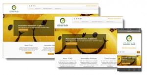
Since we, TCAG, are seeing a real spike in demand from associations wanting to upgrade their association website to have a responsive design, we thought it would be a good idea for us to upgrade our own website with a responsive design. So, what you are seeing now is the result of that effort.
Here are a few things we learned from the experience.
1) Responsive or not, building an interesting website is kinda hard.
Because at the end of the day, you have to have something compelling to say. Sometimes, after a long day of working on client projects and deadlines, it is a little hard to ‘be interesting’. So for this first version of the site, we are happy with the content, but you can expect a lot of tinkering and word-smithing in the weeks to come.
2) Don’t create a responsive design from scratch.
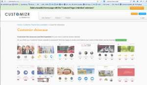
Jump start your project by finding an existing, bootstrap-enabled responsive theme. Then customize that theme to produce your final website. That is what we wound up doing for this site. First we created a WordPress site on Bluehost. Then we looked at a lot of free and/or low cost responsive themes for WordPress. We stumbled upon Customizr. It was already Twitter Bootstrap-enabled (preferably Bootstrap 3.0) and it had a large gallery of existing sites using the theme which made it very easy to see what was possible (and what to avoid). A couple clicks and the theme was installed on our WordPress site. Then the real work began. Tweaking the color scheme. Tweaking some of the CSS. Finding compelling images. Rethinking how to organize our content. And rewriting a lot of the content.
3) Don’t underestimate the complexity of rolling out a responsive design.
If you thought it was hard enough to make a good looking site for someone looking at it on a large computer monitor, get ready for the schizophrenia that comes with trying to make the same design look good across all devices. While starting with a responsive theme will help a lot, there is still a fair amount of fine
tuning to make any site look good across all device interfaces. Don’t say you weren’t warned!
While we still have work to do before we are truly satisfied with our new site, I have to say that it has been a fantastic learning experience. We look forward to applying our new found understanding into a high quality service we can provide our association clients.
Brett


